2013 Summer Color Trends

Color Memories Inspire Us Today
Color holds strong memories of times past; inspire our color choices today.
We all have color memories that shape how we view and use color. For each person it is different depending on how we were influenced by family, travel, activities and friends. Do you remember the color of your bedroom when you were small? Did your Grandfather have a hobby that was shared with you? Did your first car, even if rusty or dented still hold good memories? Does a special vacation hold wonderful memories?
Your color attitudes today are directly linked to these experiences. These memories can hold powerful feelings when you experience these colors. Do you find yourself saying “I love this color” or “I hate this color” because of an experience? This is never so true than American’s love affair with team sports, be it high school, college or professional. Many a bedroom has been painted team colors to show your devotion. As you look for color inspiration, think back to experiences in your life you want to capture and use those colors to recreate that time. Use your color memories to help inspire color in your life!
Color Watch
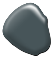
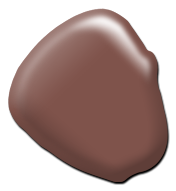
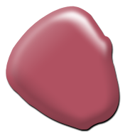
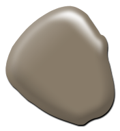
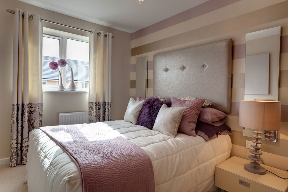 Red Watch corals, pinks and rose gain popularity as we continue to be influenced by China and the Far East. These colors paired with Navy and aqua create interesting combinations that are new to North America. Rusty reds are making a comeback; this comfort color addresses our search for rooms that are cozy and inviting. Grey Metallic finishes used on greys, champagnes and blended grey/browns are keeping neutrals fresh. The type of finish used on a surface will be as important as the color. Finishes ranging from metallic mid-sheens to ultra-flat (chalky patinas) drive the new looks for greys and neutrals. Blue With the push to get color from organic sources, Indigo continues its importance and influences other colors. Peacock teals paired with pinks and corals are making a statement and are influenced by Latin America. Green From mint to forest, green continues its appeal and influence in the market.
Authentic, mood setting, brilliant... Your essential color...
Diamond Vogel Paint Summer 2013 Color Palette
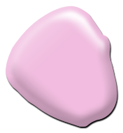
1156 Pink Heath
Playful and sweet, a flirty pink that pairs well as an accent to yellow-greens, teals and bright blues.
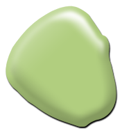
0772 Wonder Woods
Sprout some fun with this fresh citron green. Great with orange, blue or bright white or a stand-alone accent where ‘fun’ is the theme!

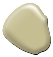
0023 Shell Tint
A soft white, fresh and new, tinted lightly with a creamy glow. Shell Tint is prefect against brighter accents, furniture and fabrics.

0681 Cyan Sky
Summer’s perfect color! This blue-green beauty reflects off cool waters and bright sky to deliver an up-beat happy vibe.

0605 Capri Isle
Deep and mysterious, this blue is full of fun and personality. A great accent with oranges, teals and pinks. Watch this color, it is trending as a must have accent for interiors.
0400 New Foliage
A soft muted sage with two lives. A new classic that pairs nicely with accents like deep teals, charcoals and reds or a color that can stand alone and offers quiet sophistication.
0501 Calm Interlude
Mysterious and seductive, an ultra-deep blue-green, perfect accent with rusty reds, yellows and greens.

0853 Lemon Lilly
A sun-kissed off-white, cheerfully delivers a soft yellow glow to any room.
0074 Emperor’s Robe
This royal hue commands attention, saturated rusts pairs well with yellows, teals and greens and offers a comfort to any combination.
1129 Punky Pink
Don’t be deceived by the name, this fresh red has a soft slightly blue undertone, a red to watch in 2013!
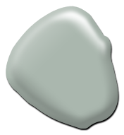
0199 Sandy Shoes
Grey’s new look, this chalky grey-brown is the best of both neutrals. Watch greys warm as they morph from cooler greys to warmer taupes, beiges and browns.
0463 Gaelic Garden
Enter the secret garden with this dreamy and peaceful blue-green. A great color to create restful rooms.

0243 Frozen Custard
A summer treat, this creamy yellow looks to kick-back and relax. Versatile when paired with greens, reds and chocolate browns.
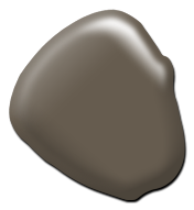
0200 Stoney Field
Earthen fields of mossy velvet, nature’s grounding color that connects brighter colors.

0982 Taste of Summer
Share the taste of this down-home orange, think orange sherbet, sweet and refreshing.

0855 Butter Tart
A sunny day full of energy and promise. Butter Tart pairs well with green, aqua, orange and brown.
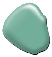
0709 Calmness
An aqua of day’s gone bye; soft and serene, a great accent with yellows, oranges and browns.