
2019 Color Trend Report by Diamond Vogel
Color can create spaces that are optimistic, meaningful, and exciting. Weaving color into our homes, especially against current palettes of gray and neutrals keeps a space fresh and relevant. Color in 2019 will be influenced by the best of the past, but re-invented to create personal spaces that are uplifting and inspirational.
Diamond Vogel offers four directional color stories for 2019:
We hope these will inspire your next color journey as we connect with the past to bring hope to the future.
Our blurred and hurried lives along with increased reliance on technology find us trying to make sense of a world that has seemingly gone mad. Looking inward and focusing on what makes us happy and secure can lead to a shift in thinking and priorities. Quiet spaces using natural materials and earth inspired colors help us find places of comfort and inner peace.
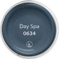
0634
This saturated Navy connects spaces, cultures, and generations. Its familiar and ageless presence makes it versatile no matter the space.Pairs well with grays, beiges and most hues.
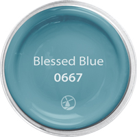
0667
A classic aqua that delivers big style while being calming and balanced. Pairs well with brown, orange, purple, and most neutrals.
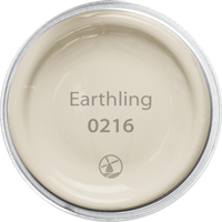
0216
Warm and inviting, this beige has a slight gray tone which pairs well with most any color, the perfect neutral.
Classics are going through a metamorphosis, a reconditioning and come forward as new and fresh hues ready to deliver. There is comfort in the familiar, but a new outlook helps us evolve and desire inspiring spaces that keep us moving forward.
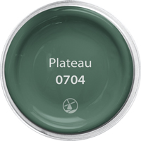
0704
Deep, lush, and confident, this natural green delivers an adventure based in nature, also acts as a grounding neutral that is comforting and relaxed when paired with brighter colors.
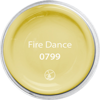
0799
A happy yellow to make you smile, this fresh hue demands attention and delivers uplifting style.
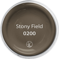
0200
This grounded neutral emerges from the earth as an accent perfect to pair with warm or cool colors.
Youthful in spirit, this palette of lively tones takes us on a journey where we are not tied to our worries, but lifted by our dreams and desires. We create fresh and unusual color combinations to express our individuality. This palette reflects our young-at-heart attitude, we are boundless, relaxed, and free.
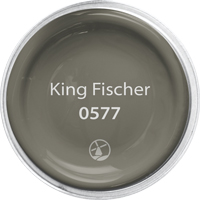
0577
This warm toned gray is sophisticated and a great backdrop for other colors that may take a leading role. Pairs well with blue, aqua, yellows and oranges.
While searching for meaningful experiences, this palette of earth-inspired tones takes us on a journey that is inspirational, spiritual, and healing. We take the reality of our life and blend it with what could be, creating spaces that are uplifting and empowering.

0373
This mid- toned sage dominates trends with its earthy appeal and offer alternatives to gray for interior walls. Its chameleon effect offers easy pairing with both warm and cool colored neutrals.
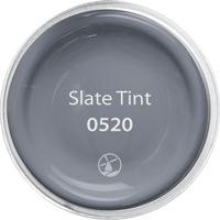
0520
A soft periwinkle that delivers sensational modern style. Pairs well as an accent because of its mystic and dreamy appeal.
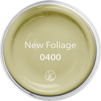
0400
A classic sage that is versatile and pairs nicely with accents like orange, brown and soft yellow, or a color that can stand alone and offers quiet sophistication.