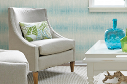
2017 Spring Color Trends
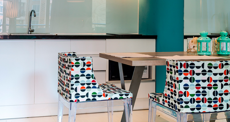
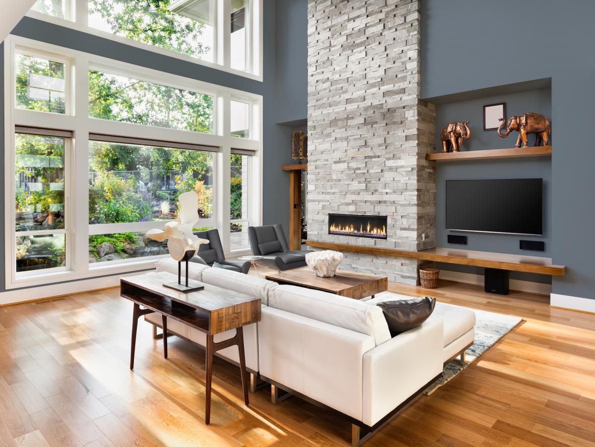
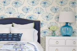
Fake news, truth, and the debate between differing views. Our current struggles are leading a shift to intentional choices to live an honest and simple life. A search for authentic design brings us to look for styles and products that are true and long lasting. Current trends for soft, muted color fit smoothly with our desire for timeless, modern design that helps us clear our mind. The early months of spring are a top time to study and select the best of what is new for trending color. Blue in all shades seems to be a perfect choice. Pale like a whisper, or intense to add drama, blue and its cousin aqua along with soft greens offer an honest and clean style to a space. We will continue to see soft, ethereal colors along with neutrals like gray, white and beige dominate our color choices.
We hope you find inspiration in our 2017 Spring Color Report. Stop by your neighborhood Diamond Vogel for samples of these great colors.
Note: On-screen and printer color representations may vary from actual paint colors.
   |
0400 New Foliage
A classic sage that is versatile and pairs nicely with accents like orange, brown and soft yellow or a color that can stand alone and offers quiet sophistication.
0701 Plunge
This mid-century mint offers modern style. Softly toned, Plunge pairs perfectly with deep berry, browns and oranges.
0451 Evening Dove
Evening’s last light, an ultra-deep brown that offers restful comfort to your space. Paris well with toned orange, peach and soft yellow.
0810 Annabel
A delicate yellow that is warm and welcoming, the perfect hue for an inviting space.
0867 Egg Noodle
Soft comfort, Egg Noodle’s happy personality offers authentic, warm glow. Pairs well with most neutrals like gray and chocolate as well as blues and greens.
|


  |
0506 Ocean Storms - Diamond Vogel Color of the Year,
this deep gray-blue transcends styles with its comfortable appeal. Pairs with browns and warm grays as well as deep berry reds and gold. Learn More!
0530 Metro
Metro blends and connects the colors it is paired with. A soft white that can be used as a neutral with cool colors.
0542 Captain Nemo
This complex gray is sophisticated, chic and ready to mix and match with any style or color.
1074 It's My Party
A free spirited orange offering fun for those looking for a fresh, edgy accent. With roots in vintage mid-century style, this hue pairs well with brown and gray neutrals, greens and yellows.
|


   |
0109 Kung FU
A blackened red… a classic beauty. Pairs well with other jewel-tones as well as greens and earth-tones.
0414 Plume Grass
Muted sage dominates trends with its earthy appeal and offers an alternative to gray for interiors. The chameleon effect of this toned green offers easy pairing with both warm and cool colors.
0549 Emu
A dramatic and sophisticated gray, a powerful accent for delivering sensational modern style. Pairs well most colors giving it universal appeal.
0665 Monet Magic
Hello spring!… this light blue creates a happy and upbeat vibe! Pairs well with cream, chocolate and yellow.
0498 Wonder Land
Peaceful and serene… this softly toned blue-grey creates a quiet haven, an escape from the world. Paris well with cream, chocolate and yellow.
|


  |
0214 Wildwood
Earthy and real, Wildwood emerges from the ground as an accent for both warm and cool colors. Great with brighter colors such as yellow, green and blue.
0222 Au Natural
A ‘natural’ foundation for a perfect space. This warm white adds balance and pairs well with almost any color.
0408 Rediscover
Rediscover offers an edgier update to popular botanical greens. Toned slightly, this color partners with deep reds, orange and toned peach.
0520 Slate Tint
A sophisticated and complex gray with a purple undertone. A perfect backdrop to sage greens, peach and yellow.
|


Not sure what color to select? Diamond Vogel® offers two great ways to preview color. Color Sampler is a quart sized sample that helps you test color before you buy. There is no better way to try a color than to paint out a sample in the space, so it can be viewed with your own furniture, lighting and accessories. You can also try testing out color in our Envision software found at diamondvogel.com/envision, upload a photo of your project and visualize any of our colors before you paint, it is just that easy! Stop by your nearest Diamond Vogel® Paint Center to find the perfect color for your project.