2017 Summer Color Trends
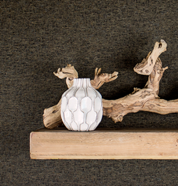
You probably have experienced it. So many color choices that you are paralyzed from making the best decision, or any decision. Choice fatigue can overwhelm and crush creative inspiration. Summer is a great time for connecting with the outdoors, finding inspiring colors and combinations for the trickiest home project. Mother Nature gets it right. Nature’s color combinations and textures are beautifully unique and unexpected. Finding color can be as easy as a nature walk or an afternoon in the garden. Nature perfectly pairs light with dark colors and soft flowers against weathered wood and stone. Unplug from technology and see if it sharpens your color instincts in your search for livable, down-to-earth color.
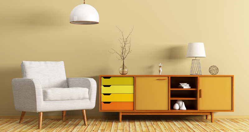
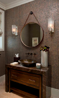
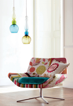
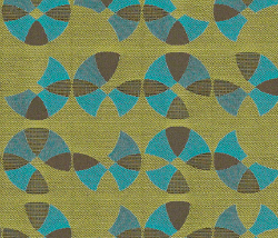
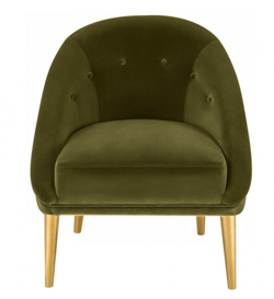
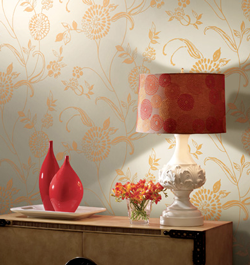
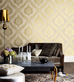
Our Summer Report shows a shift to warmer neutrals including browns, golds and yellows that offer an alternative to popular greys. Green continues to influence, including deep forest green, an accent that wraps its arms around you and creates a comfortable space. Small pops of bright color, reminiscent of the ‘80’s bring life to basic neutral palettes. Deep berry accents along with oranges and reds add a fun factor to interior spaces.
We hope you find inspiration in our 2017 Summer Color Report. Stop by your neighborhood Diamond Vogel for samples of these great colors. We've included a coupon at the end of this post for a free color sampler.
Note: On-screen and printer color representations may vary from actual paint colors.|
|
1222 Grape Soda
An accent with attitude, a blacked plum perfect to balance lighter colors or pairs well with teal, green or orange.
0701 Plunge
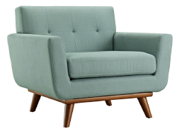
A distinctly modern take on mint, a soft hue that is easy to use with popular neutrals including browns and greys.
0393 Inviting Gesture
A soft and romantic green that sets a calm tone, that is cleansing and balanced. Watch cool colors shift to warmer tones, Inviting Gesture is a great backdrop for easy living.
0199 Sandy Shoes
Feel the sandy earth beneath your feet. A soft brown offering a solid foundation for lighter and brighter colors.
0982 Taste of Summer
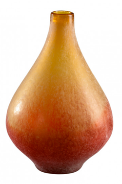
This fruity orange awakens our memories of summer days with refreshing citrus treats. A slightly toned orange that invites fun and makes us smile. Pairs well with popular browns, yellow-greens and aqua
|


0283 Historic Town
A toned gold that offers stability, a great foundation to showcase bolder accents. Pairs well with deep toned gold, orange and green accents.
0584 Queen Lioness
The master of richness, this gold toned brown delivers elegance when paired as an accent with most colors.
0800 Yellow Umbrella
An impact color that challenging us to take notice. Pairs well with strong accents like bright teal, red and orange, or can stand alone with black and white and be the star!
OW3 Cotton White
Our most popular white! Calm, relaxed and peaceful, this soft white perfectly pairs with all colors.
0681 Cyan Sky
This blue-green beauty reflects off cool waters and bright sky to deliver an up-beat vibe. Pair with plum, yellow or orange for dramatic style. |
 curiousa & curiousa
|


|
|
0584 Tornado Wind
Weathered by wind and earth, a sturdy browned-grey, this ultra-deep accent grounds bright colors, yet pairs well with softly toned hues like yellow, sage green or orange.
1100 Heart to Heart
A powerful accent that delivers energy and strength, this peachy-red offers a passionate punch. Pairs well with warm or cool neutrals, as well as green and yellow, giving it universal appeal.
0013 Sphere
Add joy and happiness to your room with this delicate yellow. Sphere will add welcome energy to your space and easily connects with lively accents and deep neturals.
0753 Baby Vegetable
Watch as deep green start to take its place in trend palettes, Baby Vegetable sprouts with refresh renewal. Deep yellow based greens are maturing and pair beautifully with light yellow, oranges and reds as well as cool grey.
|


|
0585 Oyster Catch
This black has personality that is gritty and tough, yet softly toned to pair with ethereal colors to create confident combinations.
0804 Sweetie Pie
Fresh yellow for spaces demanding uplifting style. A happy yellow to make you smile.
0707 Shimmering Glade
This mid-century mint offers energy with nostalgic style. A hue that pairs perfectly with deep berry, browns and earthy oranges.
1075 Cherry Blink
The appeal of orange and design power of red, Cherry Blink energizes a space with its friendly and uplifting charm. |
|


Not sure what color to select? Diamond Vogel® offers two great ways to preview color. Color Sampler is a quart sized sample that helps you test color before you buy. There is no better way to try a color than to paint out a sample in the space, so it can be viewed with your own furniture, lighting and accessories. You can also try testing out color in our Envision software found at diamondvogel.com/envision, upload a photo of your project and visualize any of our colors before you paint, it is just that easy! Stop by your nearest Diamond Vogel Paint Store to find the perfect color for your project.