2022 Color Trends
As we set a path forward from the pandemic, we search for ways to streamline and find balance in our lives. Fresh color can offer inspiration by providing quiet, restful spaces, or energize us to take action. Diamond Vogel’s 2022 Trend Palettes offer collections that deliver optimism, energy, confidence, and meditative reflection.
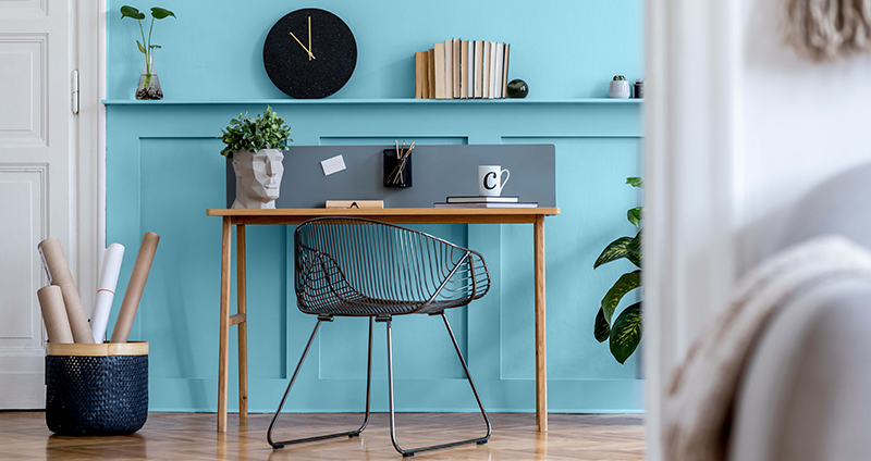
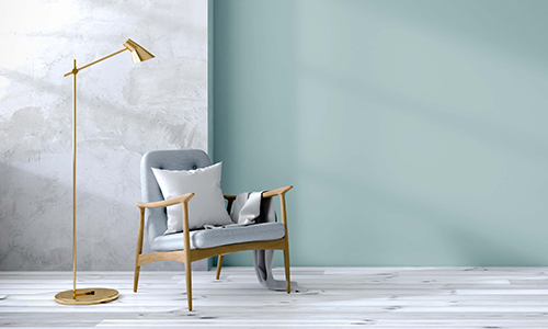
Simply Home
Home is our shelter, protector, and identity. We ask a lot of our dwellings: to keep us safe, give us a place to rest, dream of the future, and work through our daily trials. Home is also an extension of our personality and style. We create spaces that reflect it and celebrate it, supporting us both physically and emotionally. This palette of soft, serene color offers hues that create these special spaces in our homes, offering us feelings of being loved, nurtured, and protected.
|
|
|
|
|
|
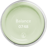
BALANCE 0748: This modern, energy-driven green delivers an upbeat feel for active spaces, celebrating wellbeing and easy living.
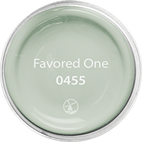
FAVORED ONE 0455: This moody sage delivers a restful, quite reflection, perfect for unwinding after a busy day.
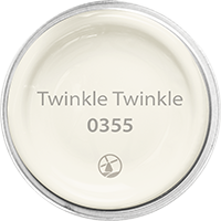
TWINKLE TWINKLE 0355: Let your room shine with this warm white that brings a soothing touch of joy.
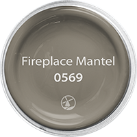
FIREPLACE MANTEL 0569: Warm and comforting, this soft brown adds coziness to a space with its nostalgic feel.
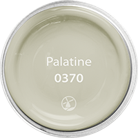
PALATINE 0370: The perfect neutral between gray and beige. Its natural patina offers soft, warm color to a room.
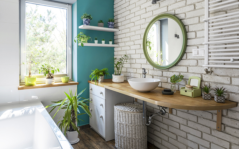
New Day
The importance of nature is highlighted in our renewed celebration and enjoyment of the outdoors. Nature refreshes itself with cleansing rains, bright sun, dark clouds, and the changing of seasons. Nature’s variety inspires this palette, celebrating shady woods, flora, water, and sky. Take time to enjoy nature’s beauty; it will cleanse your soul and grant you clarity of mind and body.
|
|
|
|
|
|
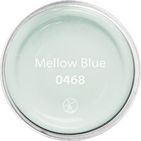
MELLOW BLUE 0468: A soft green kissed with blue brings a serene and calming presence to any space.
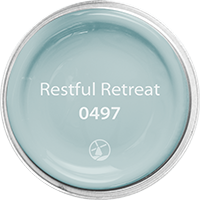
RESTFUL RETREAT 0497: This quiet blue calms the mind offering a relaxing vibe. Restful Retreat perfectly pairs with pastel shades and deep neutrals like soft blacks, browns, and grays.
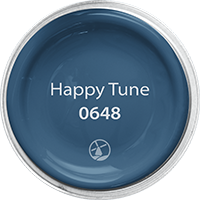
HAPPY TUNE 0648: Classic style sings a happy tune with this time-honored navy blue. Modern and sure to please, use in a starring role with white or pair with brighter colors as a neutral to balance a space.
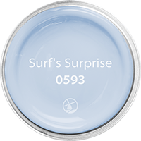
SURF'S SURPRISE 0593: This soft toned violet-blue delivers a beautiful and serene tranquility that helps clear the mind.
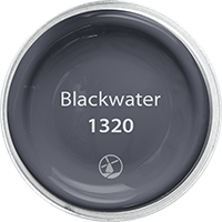
BLACKWATER 1320: Is it black or is it blue? A mysterious ultra-deep accent that adds interest to lighter colors.
 |
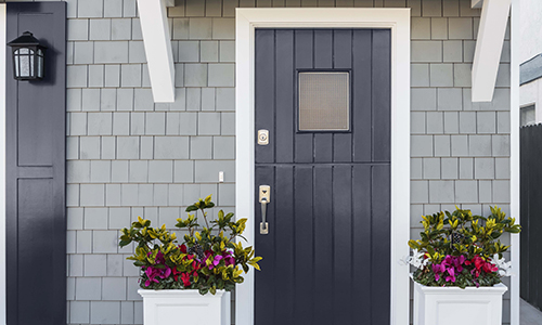 |
No Boundaries
One consideration that has come out of the pandemic is the desire to live our best life, even if it is different than how we imagined. Living a life of joy and abundance does not need to be based in material things. There are many ways to find new experiences, develop new friendships, explore a new hobby or craft, or take a class that exposes you to new ideas. We challenge you to find your next adventure in color, placing no boundaries on where you go next. Color adds excitement, offers joy, and can help deliver a new perspective.
|
|
|
|
|
|
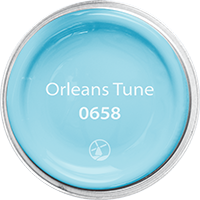
ORLEANS TUNE 0658: Inspired by blue skies, this eye-catching hue offers cheerful fun and an energetic mood. Pairs well with bright colors or stands alone as the star of the room.
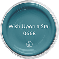
WISH UPON A STAR 0668: Mysterious and exotic, explore uncharted earth and sky with this deep teal. A great accent when paired with warm and cool neutrals, golds, reds, and purples.
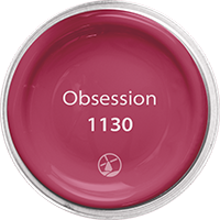
OBSESSION 1130: A vibrant red that delivers excitement and drama and demands attention. Obsession used as an accent invites positive energy and offers a powerful presence.
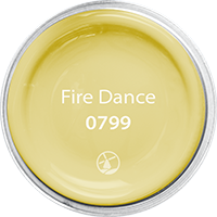
FIRE DANCE 0799: A happy yellow to make you smile, this fresh hue demands attention and delivers uplifting style.
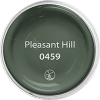
PLEASANT HILL 0459: A deep green rooted in nature that beautifully complements a space with this friendly style. Use as an accent with bright colors or let it shine with light neutrals.
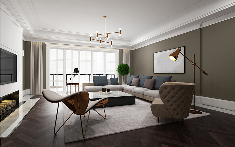
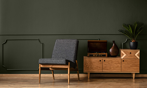
Comfort Zone
We must adapt to change as a necessity of life. It is constant in the human experience, but it is not easy to embrace. With so many challenges before us, remembering to include expressions of kindness, encouragement, and comfort to ourselves and others empowers us to move through difficulties. This palette offers colors of strength and resilience, helping to create environments that both inspire and comfort.
|
|
|
|
|
|
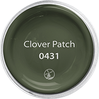
CLOVER PATCH 0431: An ultra-deep green, this color offers quiet strength inspired by earthen shadows and cool forest paths. It pairs well with lighter earth tones, greens, and blues to deliver a moody atmosphere.
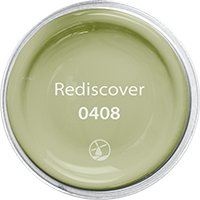
REDISCOVER 0408: Rediscover offers an edgier update to popular botanical greens. Slightly toned, this color partners with deep reds, orange, and soft peach.
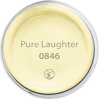
PURE LAUGHTER 0846: Soft and easy, Pure Laughter’s happy personality glows with authentic warmth. Pairs well with most neutrals like gray and chocolate, as well as blues and greens.
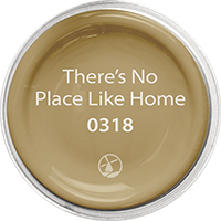
THERE'S NO PLACE LIKE HOME 0318: An updated gold well suited for today’s home. Its nostalgic feel delivers comfortable living that welcomes all and beautifully pairs with white and near-white cabinets and trim, as well as deep blue, terracotta, and earthy browns.
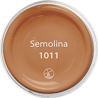
SEMOLINA 1011: Nature’s beauty is celebrated and honored with this deep homespun terracotta. Artisans recognize the warm and welcoming feeling that this earthy color conveys. Pairs perfectly with greens, blues, and golds.
 |
 |
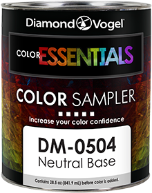
two great ways to sample color
Not sure which hue is right for you? Diamond Vogel offers two convenient ways to preview colors.
 |
 |
|
Color Sampler |
Envision |