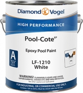
Color holds strong memories of times past; inspire our color choices today.
We all have color memories that shape how we view and use color. For each person it is different depending on how we were influenced by family, travel, activities and friends. Do you remember the color of your bedroom when you were small? Did your Grandfather have a hobby that was shared with you? Did your first car, even if rusty or dented still hold good memories? Does a special vacation hold wonderful memories?
Your color attitudes today are directly linked to these experiences. These memories can hold powerful feelings when you experience these colors. Do you find yourself saying “I love this color” or “I hate this color” because of an experience? This is never so true than American’s love affair with team sports, be it high school, college or professional. Many a bedroom has been painted team colors to show your devotion. As you look for color inspiration, think back to experiences in your life you want to capture and use those colors to recreate that time. Use your color memories to help inspire color in your life!
Red Watch corals, pinks and rose gain popularity as we continue to be influenced by China and the Far East. These colors paired with Navy and aqua create interesting combinations that are new to North America. Rusty reds are making a comeback; this comfort color addresses our search for rooms that are cozy and inviting. Grey Metallic finishes used on greys, champagnes and blended grey/browns are keeping neutrals fresh. The type of finish used on a surface will be as important as the color. Finishes ranging from metallic mid-sheens to ultra-flat (chalky patinas) drive the new looks for greys and neutrals. Blue With the push to get color from organic sources, Indigo continues its importance and influences other colors. Peacock teals paired with pinks and corals are making a statement and are influenced by Latin America. Green From mint to forest, green continues its appeal and influence in the market.
Diamond Vogel® offers two great ways to preview color. Color Sampler is a quart sized sample that helps you test color before you buy. There is no better way to try a color than to paint out a sample in the space, so you can see it with your own furniture, lighting and accessories. You can also try testing out color in our Envision software found at diamondvogel.com/envision upload a photo of your project and visualize any of our colors before you paint, it is just that easy! Stop by your nearest Diamond Vogel® Paint Center to find the perfect color for your project.
Playful and sweet, a flirty pink that pairs well as an accent to yellow-greens, teals and bright blues.
Sprout some fun with this fresh citron green. Great with orange, blue or bright white or a stand-alone accent where ‘fun’ is the theme!
A soft white, fresh and new, tinted lightly with a creamy glow. Shell Tint is prefect against brighter accents, furniture and fabrics.
Summer’s perfect color! This blue-green beauty reflects off cool waters and bright sky to deliver an up-beat happy vibe.
Deep and mysterious, this blue is full of fun and personality. A great accent with oranges, teals and pinks. Watch this color, it is trending as a must have accent for interiors.
A soft muted sage with two lives. A new classic that pairs nicely with accents like deep teals, charcoals and reds or a color that can stand alone and offers quiet sophistication.
Mysterious and seductive, an ultra-deep blue-green, perfect accent with rusty reds, yellows and greens.
A sun-kissed off-white, cheerfully delivers a soft yellow glow to any room.
This royal hue commands attention, saturated rusts pairs well with yellows, teals and greens and offers a comfort to any combination.
Don’t be deceived by the name, this fresh red has a soft slightly blue undertone, a red to watch in 2013!
Grey’s new look, this chalky grey-brown is the best of both neutrals. Watch greys warm as they morph from cooler greys to warmer taupes, beiges and browns.
Enter the secret garden with this dreamy and peaceful blue-green. A great color to create restful rooms.
A summer treat, this creamy yellow looks to kick-back and relax. Versatile when paired with greens, reds and chocolate browns.
Earthen fields of mossy velvet, nature’s grounding color that connects brighter colors.
Share the taste of this down-home orange, think orange sherbet, sweet and refreshing.
A sunny day full of energy and promise. Butter Tart pairs well with green, aqua, orange and brown.
An aqua of day’s gone bye; soft and serene, a great accent with yellows, oranges and browns.