2020 Color Trend Report
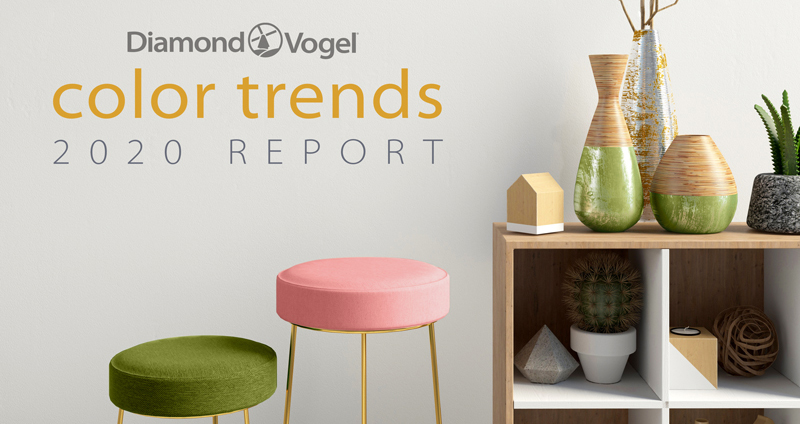
Our 2020 Trend Palettes provide subtle yet lively and distinct measures of inspiration along our daily paths. It could be memories of a cherished piece, soft shades that offer a respite at the end of the day, or vibrant tones to inspire and motivate us to move beyond hesitation and obstacles. Whatever speaks to you, these dynamic palettes of timeless colors are sure to please.
Diamond Vogel offers four directional color stories for 2020, Quiet Time, Pathway, Homespun, and Group Hug. We hope these will inspire your next color journey as you find inspiration along your daily path.
quiet time
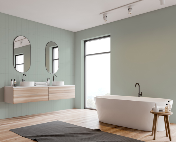
This palette of soft, muted colors offers sanctuary amid our hectic and often complex lives. Blending near whites, blues, and greens with darker neutrals creates spaces that soothe the soul and recharge the mind.
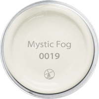 |  |  |  |  |
MYSTIC FOG 0019: Calm, relaxed, and peaceful, this soft white pairs perfectly with all colors.
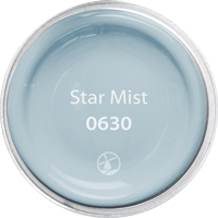
STAR MIST 0630: A harmonious balance between blue and gray, this light and airy hue invites relaxation and new beginnings.
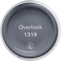
OVERLOOK 1319: Larger than life, an ultra-deep gray-violet shade perfect for grounding light pastels or accenting brighter colors. A striking and modern accent that pairs well with most colors, giving it universal appeal.
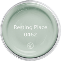
RESTING PLACE 0462: A soft mint described as ‘nostalgia meets clean and simple’. A mid-century hue that is calming and balanced, providing a restful retreat.
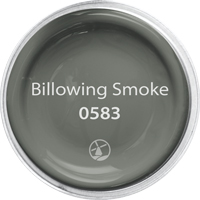
BILLOWING SMOKE 0583: A dramatic deep green with a gritty yet nuanced personality, enabling it to pair with ethereal colors, creating unique and confident combinations.
 |  |
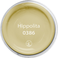
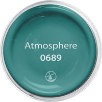
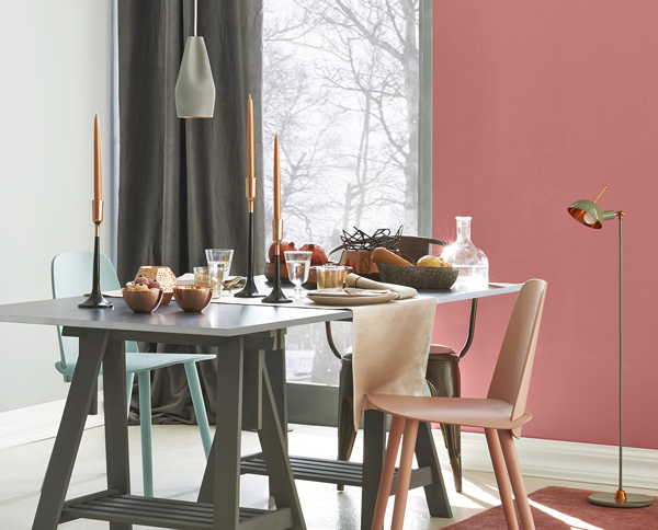
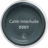
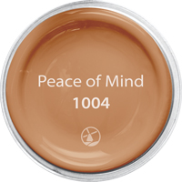
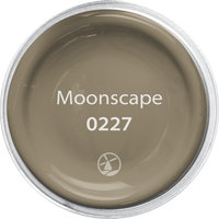
pathway
As we navigate our busy lives, we are confronted with the challenges of how to manage distractions, assess information, and stay centered amid the noise of our modern world. To help us determine and prioritize what is most important, or which pathways to follow, we search both consciously and subconsciously for those elements and cues that add value, passion, and meaning to it all.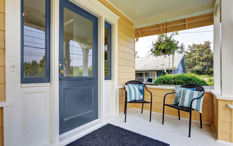
|
|
|
|
|
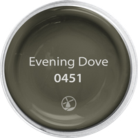
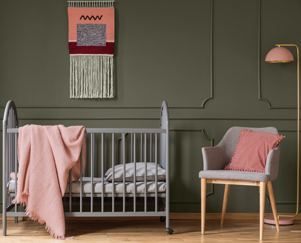
homespun
Unique and personal spaces are the inspiration for this palette of eclectic hues that tie styles and passions together. An authentic home is a combination of old and new. Curating family keepsakes, travel treasures, and exciting new pieces can make defining your own style a challenge. Color comes to the rescue with its power to tie disparate elements together into one cohesive design. New and vintage coexist in today’s uncompromising bespoke attitude, with the mixing and matching of styles coalescing to create a look that is uniquely yours.
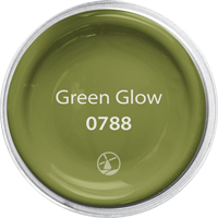 |  |  |  |  |
GREEN GLOW 0788: Green Glow sprouts with lush and vibrant renewal. Deep yellow-based greens pair beautifully with yellow, oranges, reds, and even cool gray.
EVENING DOVE 0451: Like the approach of evening’s last light, this ultra-deep brown offers a sense of restful comfort and solace. Pairs well with toned orange, peach, pink, and soft yellow.
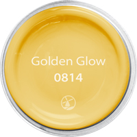
GOLDEN GLOW 0814: An impact color that challenges us to take notice. Pairs well with strong accents like bright teal, red, and orange, or can be a stand-alone with black and white for a sophisticated flair.
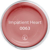
IMPATIENT HEART 0063: A free-spirited peachy-orange offering a fun, fresh, and edgy accent. With roots in vintage mid-century style, this hue pairs well with brown and gray neutrals, greens, and yellows.
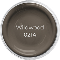
WILDWOOD 0214: Earthy and real, Wildwood emerges from the ground as an accent for both warm and cool colors. Great with brighter colors such as yellow, green, and blue.
 |  |
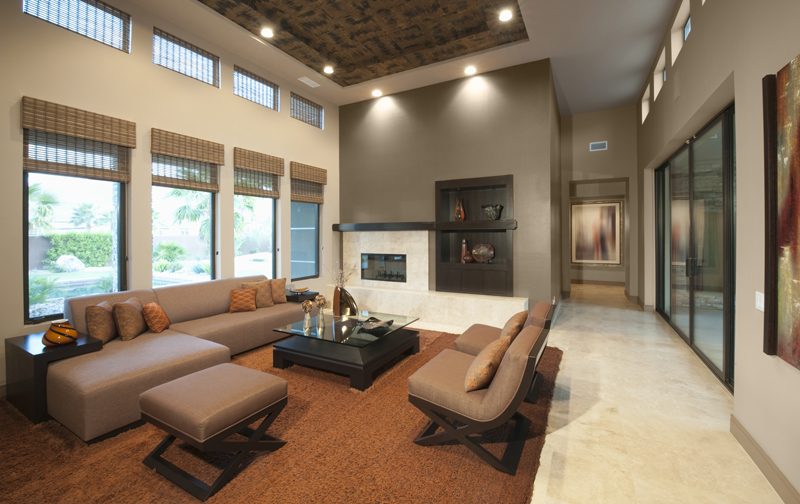
group hug
Color has a way of uniting us. Its universal and instinctual appeal helps connect us even if we may not always agree. Group Hug honors our human need to belong, to laugh, and to love. This palette of earth-inspired colors conveys a grounded and secure feel, wrapping us in a reassuring embrace, providing the simple human touch we all desire.
|
|
|
|
|
![]()
![]()
![]()
![]()