Color Trends | Winter 2016
SIMPLIFY WITH A RELAXED MODERN STYLE
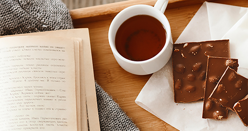
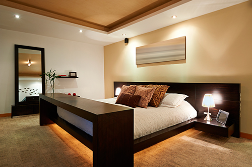
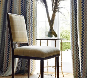
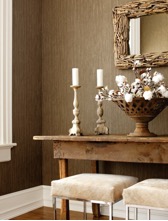
Modern simplicity showcases much of today’s design style. As we turn to 2016, themes of creating restful havens within our home continue to take focus. Stepping away from computers, phones and embracing downtime helps us towards this goal. Design elements taken from nature are a perfect partner in the quest for modern stylings. Their timeless story helps us balance our lives. Modernized versions of wood grains that have been hand scraped, textural surfaces that mirror exotic finishes and updated geometric designs add to this refreshed style.
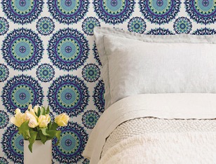
Also influencing color are global styles incorporating the exciting and unusual. With the opening of Cuba, the spotlight on Rio de Janeiro for the Summer Games and our emerging awareness of lands near and far, our 2016 Winter Palette honors these influences and our quest for usable colors that add spirit and personality.
|  1312 Southern Belle 1312 Southern Belle
Romantic, yet modern and luxurious; Southern Belle pampers and indulges us. Pairs well with popular grays as well as aqua, soft greens and gold.
 0485 North Beach Blue 0485 North Beach Blue
Peaceful and serene… this dusty aqua creates a quiet haven, an escape from our busy lives. Pairs well with cream, chocolate and yellow.
 0414 Plume Grass 0414 Plume Grass
A soft organic sage that is calming and balanced. Plays well with chocolate brown, blues, purple and deep rusty reds.
 0275 Highlight 0275 Highlight
An emerging trend color, this soft gold is earthy yet makes a statement.. Use as an accent with gray, or it can be a star when used with soft blue, chocolate and deep reds.
|
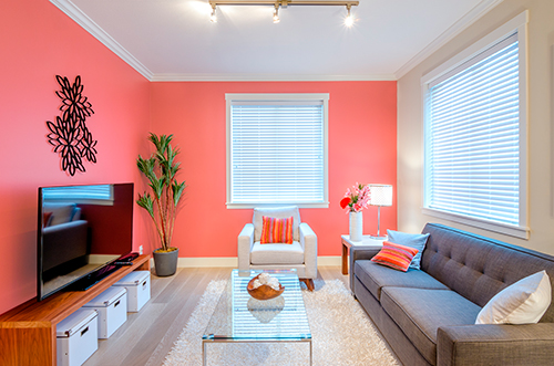
 1087 Bay Coral 1087 Bay Coral
This zippy accent color adds motion and life to popular grays and neutrals. Use in combination with neutrals to transform a space from ordinary to amazing.
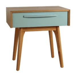
 0701 Plunge 0701 Plunge
This mid-century mint offers a modern edge. Softly toned, Plunge pairs perfectly with deep berry, browns and oranges.
 0506 Ocean Storms 0506 Ocean Storms
This deep complex blue transcends styles with its comfortable appeal. Pairs with browns and warm grays as well as deep berry reds and gold.
 0124 Merlins Beard 0124 Merlins Beard
A soft-toned off-white to warm any space. Its soft romantic feel pairs with warm grays, browns and deep berry reds as well as purple.
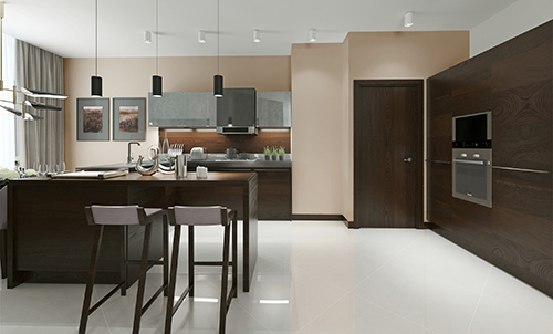
 0148 Oak Plank 0148 Oak Plank
Oak Plank blends an earthy neutral with a touch of dusty red to create an artisan hue that is up and coming. This restful hue pairs nicely with greys, browns, charcoal and blues.
| |
|  0589 Celestial Horizon 0589 Celestial Horizon
This relaxing violet-blue that reaches to the heavens and delivers a low key vibe. Use as a soft romantic accent or a pop of color to add mystery.
 0196 Overgrown 0196 Overgrown
The perfect background. Calm, relaxed, peaceful.. this soft beige perfectly pairs with all colors.

1008 Mango Tango
This soft orange’s strength is in its upbeat energy and ability to deliver a versatile punch of color. Pairs well with brown and grey along with blue and green.  0556 Smokescreen 0556 SmokescreenThis deep gray-brown is a great base for showcasing stronger colors or smoky pastels. Perfect to pair with greens, oranges, blues and corals.  0806 Sweet Angelica 0806 Sweet AngelicaA warm optimistic yellow that offers a ‘never setting sun’ that brightens a room with energy. Pairs well with aqua, orange and popular grays. |
 0102 Earthly Pleasure 0102 Earthly Pleasure
A deep organic red that is rich and authentic. An ‘almost neutral’ with an influence of brown and cinnamon. A great accent for grays and yellows and a perfect accent for exteriors.
 0381 Sonata 0381 Sonata
Deeply rooted in nature with a vintage twist, Sonata pairs well with many of the greys and browns currently trending.
 0232 Frond 0232 Frond
Warm and inviting, Frond is a beige with a slight gray undertone. Pairs well with almost any color, the perfect neutral.
 1005 Flickering Flame 1005 Flickering Flame
With the emerging popularity of brass, rusted iron and copper, Flickering Flame is a trend color to watch. This hue easily coordinates with both warm and cool colors making it an adaptable color for any space.
| 
|