2019 Color Trend Report
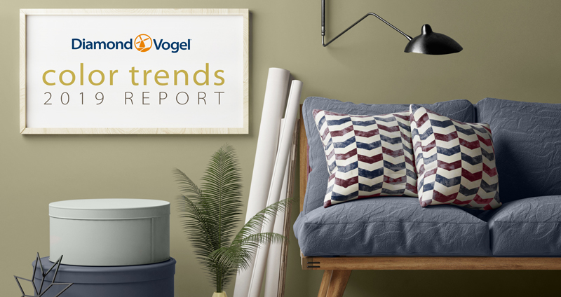
Color can create spaces that are optimistic, meaningful, and exciting. Weaving color into our homes, especially against current palettes of gray and neutrals keeps a space fresh and relevant. Color in 2019 will be influenced by the best of the past, but re-invented to create personal spaces that are uplifting and inspirational.
Diamond Vogel offers four directional color stories for 2019, Inner Shift, Rēˈtool, Boundless, and Connecting Our Dreams. We hope these will inspire your next color journey as we connect with the past to bring hope to the future.
inner shift
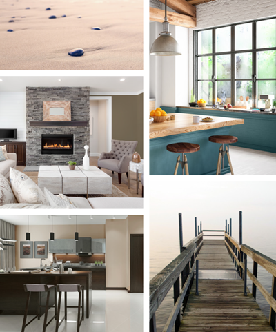
Our blurred and hurried lives along with increased reliance on technology find us trying to make sense of a world that has seemingly gone mad. Looking inward and focusing on what makes us happy and secure can lead to a shift in thinking and priorities. Quiet spaces using natural materials and earth inspired colors help us find places of comfort and inner peace.
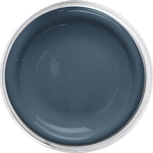 |  |  |  |  |
 DAY SPA 0634: This saturated Navy connects spaces, cultures, and generations. Its familiar and ageless presence makes it versatile no matter the space. Pairs well with grays, beiges and most hues.
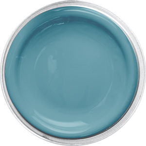
BLESSED BLUE 0667: A classic aqua that delivers big style while being calming and balanced. Pairs well with brown, orange, purple, and most neutrals.
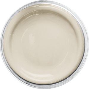
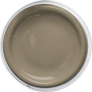
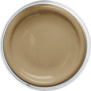
EARTHLING 0216: Warm and inviting, this beige has a slight gray tone which pairs well with most any color, the perfect neutral.
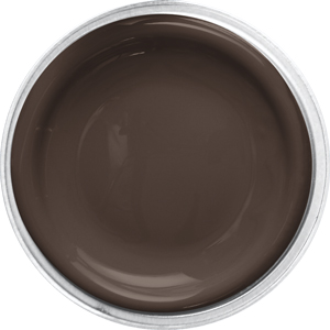
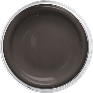
FILM NOIR 0144: Weathered by wind and earth, this ultra-deep brown grounds colorful accents, yet pairs well with softly toned hues like beige, brown, and blue.
MOONSCAPE 0227: This soft neutral combines gray and brown for a versatile and modern color. Moonscape pairs well with white or cream trim and accents rusty reds, oranges and popular blues.
rēˈto͞ol
Classics are going through a metamorphosis, a reconditioning and coming forward as new and fresh hues ready to deliver. There is comfort in the familiar, but a new outlook helps us evolve and desire inspiring spaces that keep us moving forward.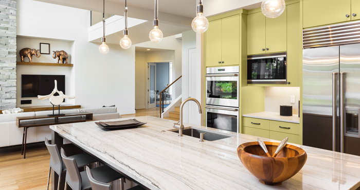
|
| 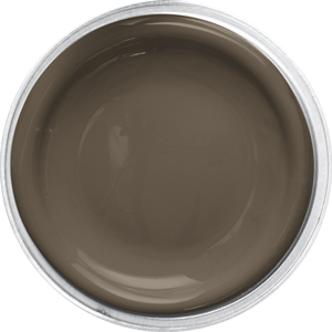 This grounded neutral emerges from the earth as an accent perfect to pair with warm or cool colors. |
| 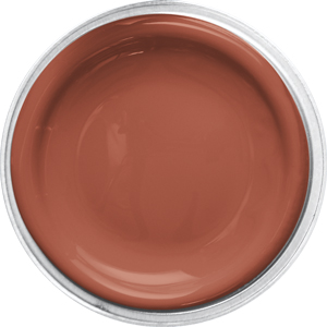 Modern with a retro vibe, this inspiring terra cotta takes us on a journey of discovery. Use as a dramatic wall accent or a pop of color to add interest to popular neutral spaces. |
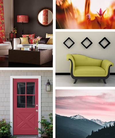
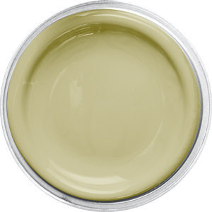
boundless
Youthful in spirit, this palette of lively tones takes us on a journey where we are not tied to our worries, but lifted by our dreams and desires. We create fresh and unusual color combinations to express our individuality. This palette reflects our young-at-heart attitude, we are boundless, relaxed, and free.
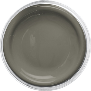
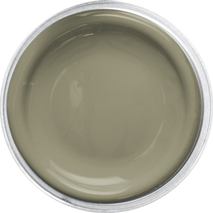
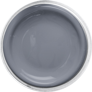
 KING FISCHER 0577: This warm toned gray is sophisticated and a great backdrop for other colors that may take a leading role. Pairs well with blue, aqua, yellows and oranges.
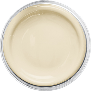
CHIC MAGNET 0313: A soft beige that celebrates the joy of simple color.
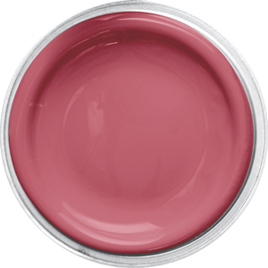
TEMPTRESS 1144: A powerful accent that delivers energy and strength, this confident pink offers a passionate punch. Pairs well with warm or cool neutrals, as well as green and yellow.
EVERMORE 0557: Evening’s last light, an ultra-deep brown that delivers restful comfort.
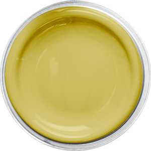
YELLOW UMBRELLA 0800: An impact color that challenging us to take notice. Pairs well with strong accents or can stand alone and be the star!
 |  |  |  |  |
connecting our dreams
While searching for meaningful experiences, this palette of earth-inspired tones takes us on a journey that is inspirational, spiritual, and healing. We take the reality of our life and blend it with what could be, creating spaces that are uplifting and empowering.
|
| 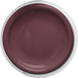 An accent with attitude, this blacked red is perfect to balance lighter colors and pairs well with as a neutral with greens, purples and gray. |
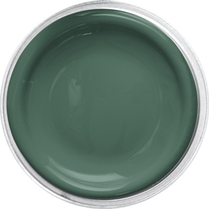
| 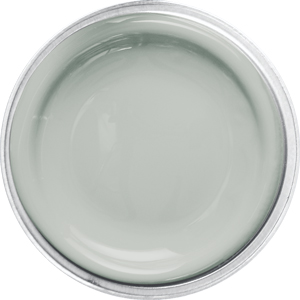 Peaceful and serene, this softly toned mint creates a quiet haven. Pairs well with cream, chocolate and yellow. |
![]()
![]()
![]()