Color Trends | Fall 2015
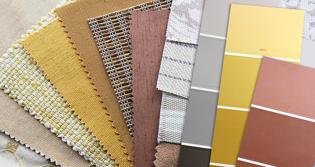
Diamond Vogel again this year offers you a unique look at the top colors selected by your neighbors for their recent painting projects. Color selection is very personal, but knowing what colors are popular in your market can provide confidence in your own selections. We surveyed Diamond Vogel Paint Stores in search of the most popular paint colors for interiors, exteriors and cabinet and trim, offering you insight into the best of color, the color your neighbors love.
Here is what is trending in these markets:
Eric A. from Minneapolis, MN
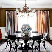
“Grays have been very popular here including 0527 London Road. Also bright yellows like 0848 Yellow Tail are gaining popularity as yellow coordinates well with grays and neutrals and accents with chocolate brown like 0192 Dapper and blues like 0486 Paradise City. Colors that were popular in the 70’s have also made a big comeback like 0382 Mount Olive, a deep olive green used for accent walls.”Judy N. from Omaha, NE
“We showcase 0547 Tin Man on a large wall in our store and love this gray! This tone is a perfect backdrop for contemporary or traditional designs. 0216 Earthling fits into many design scapes, its soft appearance does not interfere with other colors. 0247 Apple Crisp is a rich golden brown that is beautiful against white cabinetry and wood work. Apple Crisp can also soften the appearance of older golden oak wood tones. A soft white that is beautiful on wood work and cabinetry is 0600 Melting Glacier, a clean white without appearing sterile or stark.”
Note: On-screen and printer color representations may vary from actual paint colors.
|  0679 Everest |
 0214 Wildwood | |
 0848 Yellow Tail | |
 0785 Misty Valley |
Alana B. from Mason City, IA
“Our most popular accent color by far is 0679 Everest! A great blue for nurseries or bathrooms. Also favored when doing a chevron look. 0183 Moth Wing is a very rich and warm neutral color. I find my customers are always drawn to it. Also 0530 Metro is soft and inviting, not too dark or intimidating. Metro is a good color to help ‘break away from the norm”. 0542 Captain Nemo is a bold gray and acts as a great contrasting color. Very popular alongside bright colors such as 0679 Everest. H106 Mineral Point from our Historic Lifestyles Collection is an oldie but a goody! The perfect beige! This color holds its spot as a favorite for all varieties of customers!”Allen M.
"Earth tones and grays seem to be the choice for interior walls. Dark grays like 0205 Wood Shadow offer a dramatic accent when combined with 0195 Mossy Shade,a good soft gray. 0148 Oak Plank, a light red-brown is gaining popularity, and combines great with blues and dark greys. On the warmer side, 0287 Muslin Tint and 0237 Flan are traditional beiges and still a popular choice."
|  0539 Place of Dust 0539 Place of Dust(Nebraska) This shadowy gray is flexible and offers a modern edge that pairs well with most colors. |
 0102 Earthly Pleasure | |
 0919 Venice Square | |
 0535 Zen Retreat | |
 0418 Onion Skin |
Lillian C. from Sioux City, IA
“A great color for open concept interiors is 0183 Moth Wing, especially used with white woodwork. Customers are choosing this color for exteriors also. 0188 Baguette is a great neutral color what blends well with a mix of carpet choices today. Customers are also looking for gray tones, 0547 Tin Man is a popular option for bringing grays into the decorating scheme since taupe and khaki have been saturating the market for years.”Katie A. from Vadnais Heights, MN
“Our most popular greige color is 0231 Desert Mirage. It is a very versatile neutral color that is actually a color and not just another boring off-white or beige. Desert Mirage goes with anything and isperfect with many accent colors! Blue-greens are all the rage, they are tranquil without being boring. 0485 North Beach Blue is perfect for places where you want to relax like bedrooms, living rooms, dens and bathrooms. 0539 Place of Dust is a very flexible gray with a slight yellow/red undertone. It is not steely like a lot of grays are. It’s a perfect color to go along with many accent colors. Purples, especially dusty purples are a very popular color for master bedrooms. 1310 Velvet Dawnis serene and simple, yet not your average wall color and pairs beautifully with gold accents.”
|  0372 Historic Shade |
 0192 Dapper | |
 0485 North Beach Blue | |
 0557 Evermore |
Kim H. from Lincoln, NE
The grays are strong here and people are liking the cool gray look of 0539 Place of Dust, it goes with really anything you put with it. An accent color in many of the new homes here is 0206 Thatched Cottage.A nice neutral gray which also pairs with any color. A lighter version of Thatched Cottage is 0198 Young Colt which people go for to achieve a great taupe look throughout. 0190 Village Crier is warm and goes great in a huge open floor plan with lots of windows and high ceilings.”Jenn L. from Iowa
“Blues like 0470 Dreaming of the Day have been on the upswing for use and people are asking for interior color combinations that involve this blue. Several salons as well as baths and bedrooms are doing variations and I see the trend of blue not ending any time soon. It’s a relaxing, calming color. 0531 Snowglory is a true light gray and can stand on its own as a color or as an accent color. It is also light enough not to overwhelm small spaces where light needs to bereflective. 0532 Rand Moon has also become a popular choice as it is still a true gray in color. It is often used in combination with 0531 Snowglory, however Rand Moon provides a greater depth to the gray for more contrast when placed next to other colors like blues, greens and reds.
|  0547 Tin Man 0547 Tin Man(Omaha, NE) A cool urban gray influenced by industrial metals. Tin Man offers a soothing contrast to our busy, connected lives and pairs well with most colors. |
 0275 Highlight | |
 0479 Stairway to Heaven | |
 0470 Dreaming of the Day | |
 0148 Oak Plank |
Tom G. from Madison, WI
“For painted wood work and cabinets 0558 Queen Anne’s Lace and 0418 Onion Skin are popular choices. These off-whites offer a soft tone and coordinate well with popular neutrals and gray walls. 0530 Metro is a good interior gray for walls that is not too dark and works with anything. 0600 Melting Glacier has been popular for those looking for a good off-white or ceiling color.”Shellie S.
“An excellent interior color is 0183 Moth Wing, not too dark for a main color, but darker than many neutrals. For exteriors, 0528 Greybeard is a nice gray, dark exteriors are very popular and Greybeard is not too blue or too brown. GS221 Willow Mist from the Grain Stain Solid Color Stain Collection is also popular for exteriors – it blends perfectly into the landscape. 0102 Earthly Pleasure is a great wine red color for exterior accents and a bold color for front doors.”
TOP NEUTRAL COLORS
|  H106 Mineral Point |
 0183 Moth Wing | |
 0175 3am Latte | |
 0530 Metro | |
 0532 Rand Moon | |
 0542 Captain Nemo |
| TOP EXTERIOR COLORS | TOP TRIM & CABINET COLORS |
0337 Urban Charm |  0600 Melting Glacier |
0535 Zen Retreat |  0011 Sugar Dust |
 GS221 Willow Mist |  OW03 Cotton White |
0102 Earthy Pleasure |  0558 Queen Anne's Lace |
0919 Venice Square |  0342 Velum Smoke |
 0212 Big Spender |