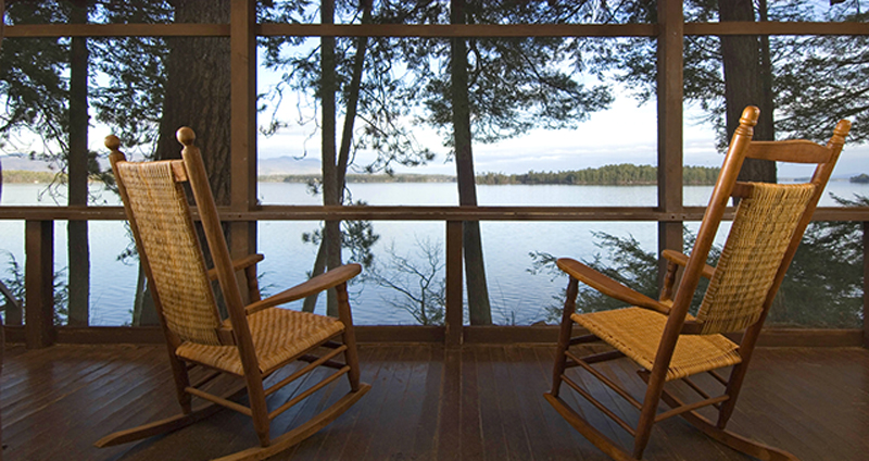
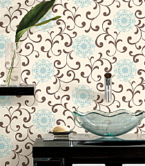
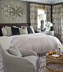
Summer is the perfect time to slip off your shoes, slow down and reconnect. Time with family and friends allows sharing of experiences, humor and memories of the past. This time can offer perspective and make you see and think in different ways. Use this time to gather and create new experiences and ideas which lend themselves to experiencing new color. Color creates harmony in the home and lets you express yourself as an individual. Sensory experiences are created through nature-inspired color from plants, flora and natural lighting. Soft bright colors convey happiness and gratitude. Chalky color connects us to emotions of the past. During these warm weather months, take time to discover inspiring color for your home, you may find it in the most unexpected places.
Design Trends
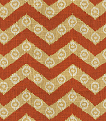
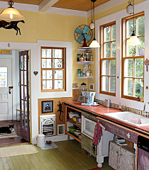
Much is reported today on a product’s provenance, history or source. This type of thoughtful design comes from our desire for authentic, natural connections and influences how and why we buy. We look to the past for ideas and motifs that are familiar and offer comfort. Checks and plaids as well as paisley and chevron designs take us back in time, but are also fresh and modern to a new generation. Nature continues to shape product styling with worn, aged or oxidized finishes. We value beauty of finishes and colors that are organic, but also dynamic. True to life colors, without any added special effects embrace these natural connections. The rise of individualism and custom design give us relief from the ordinary. Watch as 'design on demand' continues to move forward with advances in digital and 3D printers.
Diamond Vogel Paint Summer 2015 Color Palette;
Note: On-screen and printer color representations may vary from actual paint colors.
| 
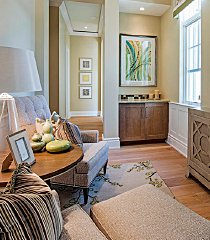
0218 Drifting Sand - This warm gray-beige offers an earthy alternative to cooler neutrals and helps support accent colors like orange-red, blue and yellow.
|

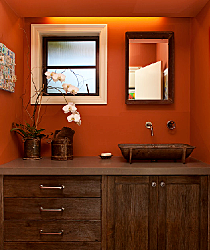
1053 Sun’s Rage - Summer’s perfect color, vintage worn and easily going. Sun’s Rage pays tribute to the best of summer; heirloom tomatoes, rhubarb and ripe peaches.
|

0273 Sandstone Palette -The perfect color to combine and coordinate, this pale sandstone is adaptable as it shifts personality depending on how it is paired.
|

0868 Shortcake - Soft and creamy, Shortcake offers an upbeat vibe, perfect to pair with neutrals like chocolate brown and grey or colorful accents like blues, greens and purples.
|
 0282 Vintage Gold - This heirloom color gives us a glimpse into days gone by; a classic that pairs with many of today’s trending colors like aqua, deep purple, red-orange and greens. | 
|
 0687 Stillwater - A light and clean aqua that adds energy with its upbeat nature. Pairs well with whites, browns and greys. |

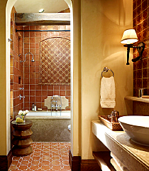
0186 Christmas Ornament - Authentic and earthy, this rich brown is the ultimate luxury neutral. Very popular for accent walls and pairs well with trending colors like blue, orange and popular greens.
|

0295 Spanish Cream - The earthy side of yellow, this soft gold creates energy in a space when paired with greys, browns and neutrals.
|
| 
0489 Whirlwind - This mint bows to its mid-century roots, but offers a fresh, modern vibe that pairs well with popular neutrals like grays, browns and chocolate.
|

0372 Historic Shade - How can history be wrong? A classic khaki that pairs with popular grays, browns, deep blue and muted golds.
|

1320 Blackwater - Is it blue or is it black? A mysterious ultra-deep accent that adds interest to lighter colors like citron, brown, beige and orange.
|

0194 August Moon - Summer’s soft, hazy light influences this toned white. August Moon pairs well with saturated accents like red, purple and blue or alone adds a soft touch of any room.
|

0336 Soft Leather - Beauty is found in this soft, muted hue reminiscent of worn leather. This mid-tone neutral offers comfort and complements well with many colors including greens, blues, reds and oranges.
| 
|

0399 Sawgrass Cottage - Deeply rooted in nature, an organic green that is calming and balanced. Pairs well with gray, beige, orange-reds and purple.
|

0386 Hippolita - A modern gold that offers a warm welcome. This earthy hue creates happiness all around.
|

0866 Apple Sauce - Fresh picked and naturally good, Apple Sauce hints of yellow and delivers a soft tone that is calming and balanced.
|