Color Trends | Spring 2015
EXPRESS YOURSELF - THE CHOICE IS YOURS
You have an interior space that you have been planning to paint. You study design blogs, websites and magazines and the ideas are plentiful, but you still have not pinned down the right color. I challenge you to toss out the objections that might be holding you back and approach your project as one of self- expression. Beyond the constant elements in a space like flooring and furniture that must be considered, painting can be done for a relatively small investment and can drastically change a room. Use color visualization tools like Diamond Vogel’s Envision or paint out a sample of the color using Diamond Vogel’s Color Sampler to help you visualize your color pick. Approach your color decision like selecting a piece of wardrobe, select color expressing your own style and personality. The design rules have changed, life is neutral enough, why not express yourself and add some color to your world!
Design Trends
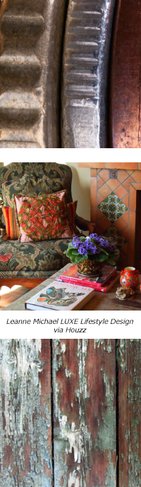
Metals have grown in importance, especially the warm tones of copper and gold. Metals will appear as accents on wood or brushed over paint finishes. Another design trend is the preservation of heritage. Classic design styles can hint of a modern update, but are shaped by the past. Surfaces are tactile and textural with shapes and textures that are suspended or have an underlying aesthetic. Patinas formed by the harsh reality of nature are gritty, and show resolve and toughness through dark, grainy woods, wrought iron and unfinished raw finishes. Romantic styles continue to emerge. These romantic designs are fanciful as luxury finishes return with the improved economy and we indulge in the finer side of design.
Diamond Vogel® Paint Spring 2015 Color Palette
Note: On-screen and printer color representations may vary from actual paint colors.
 | 
0557 Evermore - Strong and straightforward, this ultra-deep accent balances brights and offers an organic twist..... pairs well with sage, aqua and popular oranges and yellows.
|

0806 Sweet Angelica - A warm optimistic yellow that offers a ‘never setting sun’ to brighten a room with energy. Pairs well with aqua, orange and popular grays.
|

0400 New Foliage - Familiar and versatile, New Foliage is a classic that pairs nicely with accents like orange, browns and soft yellow or a color that can stand alone and offers quiet sophistication.
|

1066 Sari - A spice orange filled with motion and life. Sari transforms a space and accents perfectly with gray, brown and black as well as other saturated colors.
|

0503 Water Droplet - Light and cleansing, a cool blue-gray that offers refreshing renewal. It pairs well with most colors both light and dark.
|  |

0667 Blessed Blue - Nostalgia meets clean and simple. A classic aqua with a modern edge. Pairs well with brown, orange, purple and most neutrals.
|

0399 Sawgrass Cottage - Deeply rooted in nature, an organic green that is calming and balanced. Pairs well with gray, beige, orange-reds and purple.
|

0581 Fossilized - Modern - yet raw and natural, this cool gray takes us on a journey of discovery as it pairs perfectly with most colors.
|
 | 
0510 Sacred Spring - As nature emerges from winter’s sleep; this misty gray transitions and offers a subtle background balancing light and dark colors.
|

0385 Howdy Neighbor - A friendly, easy yellow that pairs well with many of the toned colors found in furniture and accessories. Great for open floor plans where you need to transition and combine many colors.
|

0202 Powder Cake - A warm toned neutral with a versatile personality. Pairs well with most colors or lets bolder colors take center stage.
|

0125 Pout - A flirty, romantic pink that pairs with popular sheer colors as well as deep neutrals like chocolate brown and charcoal grays.
|

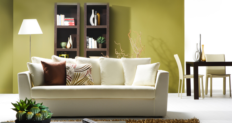
0093 Herald of Spring - This earthy red offers the promise of renewal. Toned softly to complement other muted colors like gold, deep blue or moss-green, Herald of Spring offers timeless appeal and partners perfectly with gray, black and charcoal.
|  |

0203 Whale Bone - Gentle like beach sands and tough as concrete, Whale Bone complements stronger colors and helps connect open concept rooms where many colors must be balanced.
|

0276 Gold Taffeta - This warm and welcoming gold offers a nod to the emerging popularity of this metallic that is replacing the cool silvers and grays that have been so popular.
|

1285 Jazlyn - This ultra-deep accent morphs between blue and purple and pairs well as a neutral. Its sentimental tone and boost of passion create harmony all around.
|